The third-party API is slow again. Prove it.
Track success rates and response times of every external API your jobs talk to. Counters, sums, and squares in. Success rate and standard deviation out.
The problem
Your infrastructure metrics are green. Your provider's are not.
Background jobs that call external APIs fail in ways your APM never sees. The provider starts returning slightly more errors. Response times creep from 400ms to 900ms over two weeks. A payload shape changes and one result code quietly spikes. Your CPU charts stay flat through all of it.
This is application-level behavior, so it needs application-level instrumentation. A few counters at the call site tell you more about a provider than any status page will.
What you track
Wrap the API call, record what happened. Raw ingredients, not conclusions.
The trick is what you store for duration: not the raw milliseconds, but count, sum, and square. Those three numbers aggregate cleanly across any time bucket and are enough to derive averages and standard deviation later. A raw duration value stops being useful the moment two calls land in the same bucket.
Success and failure are separate counters, and interesting response codes get their own nested branch. When something goes wrong you want to know which kind of wrong.
This works for any code path, not just HTTP calls. Cache hits, PDF renders, import batches. Anywhere you'd be tempted to add a log line, a counter is usually more useful.
duration = Benchmark.realtime { response = api.sync(products) }

Trifle::Stats.track(
  key: 'api::inventory::sync',
  at: Time.zone.now,
  values: {
    count: 1,
    success: response.ok? ? 1 : 0,
    failure: response.ok? ? 0 : 1,
    duration: {
      count: 1,
      sum: duration,
      square: duration**2
    },
    codes: { response.status => 1 }
  }
)
What you get back
Transponders turn the raw counters into the numbers you actually wanted.
series = Trifle::Stats.series(
  key: 'api::inventory::sync',
  from: 7.days.ago, to: Time.zone.now,
  granularity: '1h'
)

# Success rate per hour, in percent
series.transpond.expression(
  paths: ['success', 'count'],
  expression: '(a / b) * 100',
  response: 'success_rate'
)

# Average response time per hour
series.transpond.expression(
  paths: ['duration.sum', 'duration.count'],
  expression: 'a / b',
  response: 'duration.avg'
)

# Standard deviation from sum, count, square
series.transpond.expression(
  paths: ['duration.sum', 'duration.count', 'duration.square'],
  expression: 'sqrt((b * c - a * a) / (b * (b - 1)))',
  response: 'duration.stddev'
)
Transponders derive new values inside the series from simple expressions. You tracked success and count, you read success rate. You tracked sum, count, and square, you read average and standard deviation.
The derived values become regular paths in the series, so they chart and aggregate like anything else. success_rate per hour over the last week is exactly the graph you want open when the provider claims everything is fine.
Standard deviation matters more than it sounds. An average that holds steady while the deviation doubles means the API got flaky, not slow. You can tell those apart now.
Alerts before the customers notice
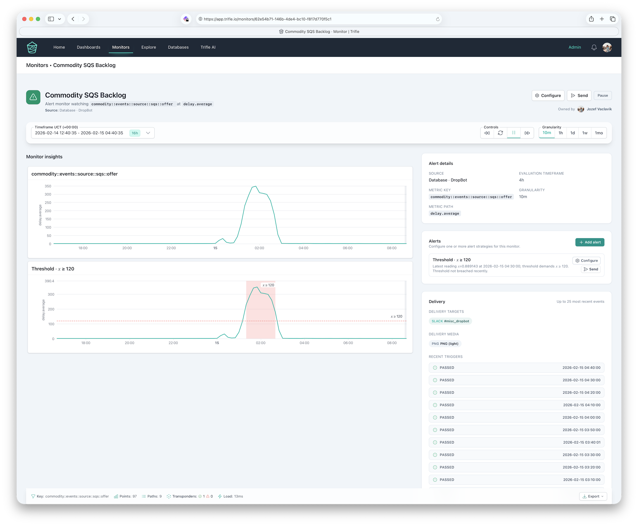
Provider degradation is gradual. Thresholds and anomaly detection catch gradual.
Put the derived success rate and latency on a Trifle App dashboard, one panel per provider. Then set monitors so nobody has to stare at it:
- Threshold alert when success rate dips below your SLA with the provider.
- Anomaly detection for latency creep that no fixed threshold would catch.
- Result code spikes that usually mean a payload change on their side.
Next time support asks "is the integration down", the answer is a chart with a timestamp, not a shrug.
Keep reading
The math and the production story behind this pattern.
Instrument the code you worry about
A counter at the call site beats a log line every time.